
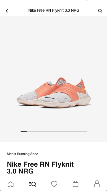
Nike Shopping App: Boasting over 300 million downloads and an exceptionally sleek design that stands the test of time.
Senior Product Designer. Functional member of a ~40 people team. Having previously worked as Art Director for Nike's account at another agency and already familiar with Nike's brand guidelines, I was hired as contractor by Huge (digital agency) to work on the Nike shopping app. This happened thanks to Fede García (ex Global Executive Creative Director at Huge in Brooklyn), with whom I share a common past: He was my professor of Creativity at the ISP in Buenos Aires.

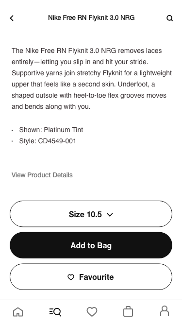
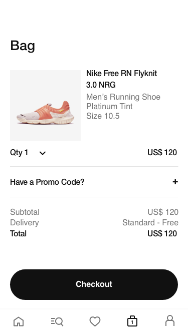
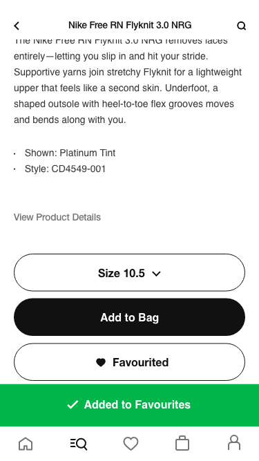
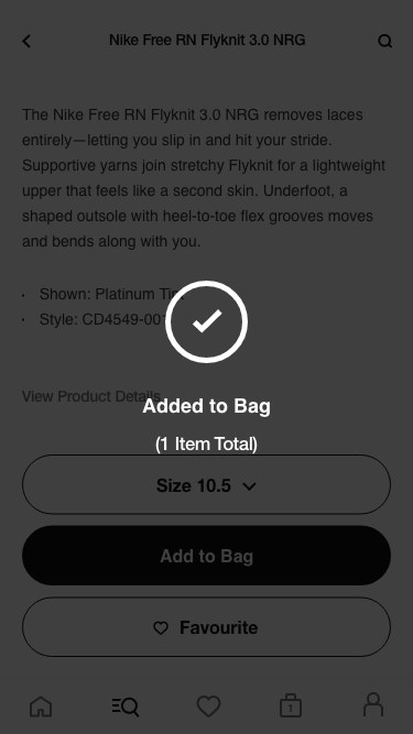
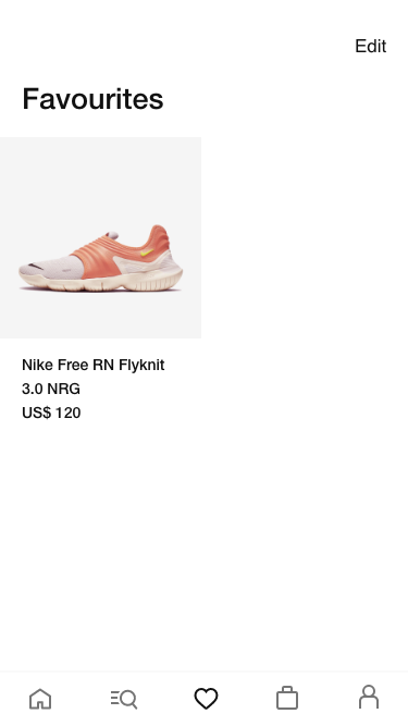
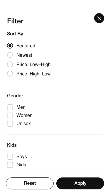
The main challenge was the timeframe. We had 9-12 months to do a job that normally would take 18 months, and 3 months to come up with a functional prototype for the pitch. The brief was as large and complex as it usually is in a company of the caliber of Nike, but the main objectives revolved around four directives: minimalistic, user-friendly, in line with Nike's mission and ideally superior to "Nike SNKRS", the most recent and successful release at the time. I was lucky to participate in the creation of the concept, feed (home), search, checkout, favs, filter, micro-interactions and countless testings and design sprints validating ideas and solving problems.
On the first prototypes, the navbar had a shopping bag icon that looked like this:

During the usability tests, we observed that many users had difficulty distinguishing whether they had added one or multiple items to the shopping bag.
We engaged in a brainstorming session to address the problem and subsequently narrowed our focus to six potential solutions. Following rigorous testing, it became evident that two of these solutions outperformed the others. Notably, we observed a heightened level of engagement from male users with one of these options, coincidentally my own proposal. My proposal was conceptually straightforward: I undertook a redesign of the bag icon to enhance its user-friendliness. Instead of featuring the item count outside the icon (badge style), as suggested by some, I integrated the numbers within the icon itself, giving birth to another design debate: "The 9+".
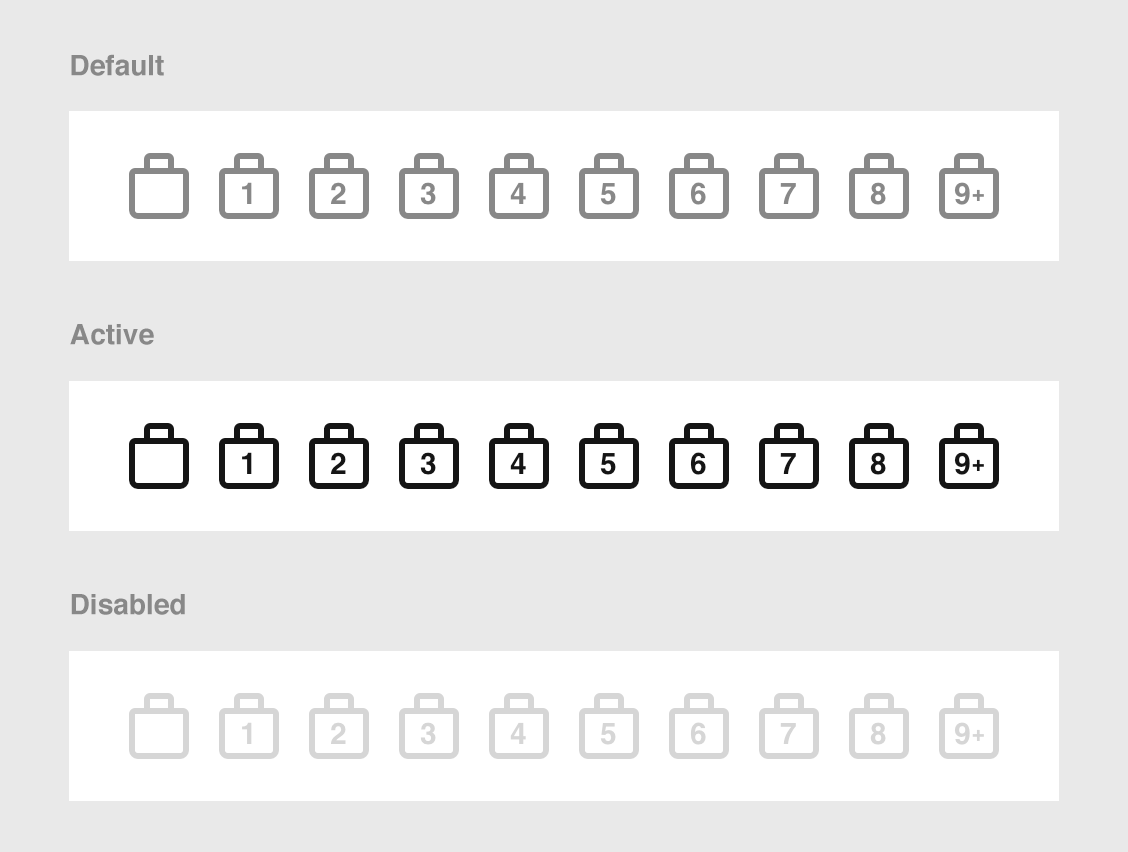
I aimed for a subtle approach, I didn't want to use red badges, large numbers or anything that could distract the eye. One reason for this was the discovery that not many people purchased more than 9 items at once. And even if they did, it seemed wise to keep the item count hidden until the final step to prevent potential distractions or order cancellations due to perceived excessiveness. As you may have already noticed, the style differs from the previous version. I opted for a more squared design to accommodate the numbers inside and to mirror the appearance of a real Nike shopping bag. This unintentional choice of cleaner lines inadvertently made the design more gender-neutral, which we believe contributed to its success, particularly with men during testing.
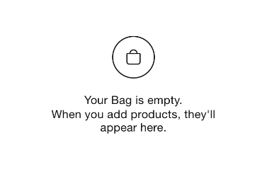
You can still find the discarded old bag icon in the app: It can be seen when the bag is empty. This could be seen as a mistake, but it was done on purpose, as the general idea of a bag, an "ideal bag", is better perceived with the rounded version, even if it is less realistic or functional.
The Nike Shopping App was in its development phase, and our team aimed to create an optimal onboarding experience before the app's official launch. The objective was to ensure that users who installed the app during beta testing had a seamless onboarding journey, which would set the stage for a successful launch.
During beta testing, we identified potential challenges related to user onboarding that could impact the app's future success. These challenges included a lack of engagement and user drop-off at key points in the onboarding process.
To address these pre-launch challenges, we conducted a thorough analysis of the beta testing phase, focusing on user feedback and behavior. Key issues identified were:
The pre-launch onboarding optimization led to notable improvements in user engagement and setup completion during beta testing:
©2023 DMM